




What Is Notices & Messages Styling
Notices & Messages Styling is a white-label option in the Classic Monks White Label tab that styles the messages on the login page. It is an independent option: it works on its own, without the Login Page Customization master toggle. It controls the background, text, and border colors of three notice types: Error Notices, Success Notices, and Info Messages.
It is separate from Login Form Styling and Navigation Links Styling. This guide covers the login page notices.
Recommendations Before Enabling
- Keep the notice colors distinct. Error, success, and info notices should stay visually different so users can tell them apart at a glance.
- Use accessible contrast. Ensure the text color contrasts with the notice background so the message is readable.
- Match your brand without breaking meaning. You can use brand colors, but keep errors red, success green, and info blue for clarity.
Style the Login Notices
Step 1: Open the Login Page Settings
In your WordPress dashboard, go to Classic Monks, open the White Label tab, then the Login Page subtab.
Step 2: Turn On Notices & Messages Styling
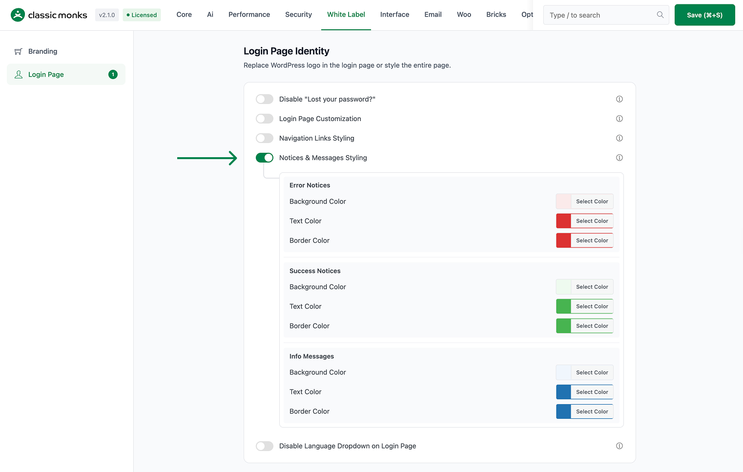
In the Notices & Messages Styling section, toggle on Notices & Messages Styling. This option works on its own; you do not need the Login Page Customization master toggle.
Step 3: Style Error Notices
Under Error Notices, set the background, text, and border colors for error messages. Defaults are a light red background (#fbeaea), red text (#dc3232), and red border (#dc3232).
Step 4: Style Success Notices
Under Success Notices, set the background, text, and border colors for success messages. Defaults are a light green background (#edfaef), green text (#46b450), and green border (#46b450).
Step 5: Style Info Messages
Under Info Messages, set the background, text, and border colors for info messages. Defaults are a light blue background (#f0f6fc), blue text (#2271b1), and blue border (#2271b1).
Step 6: Save and Test
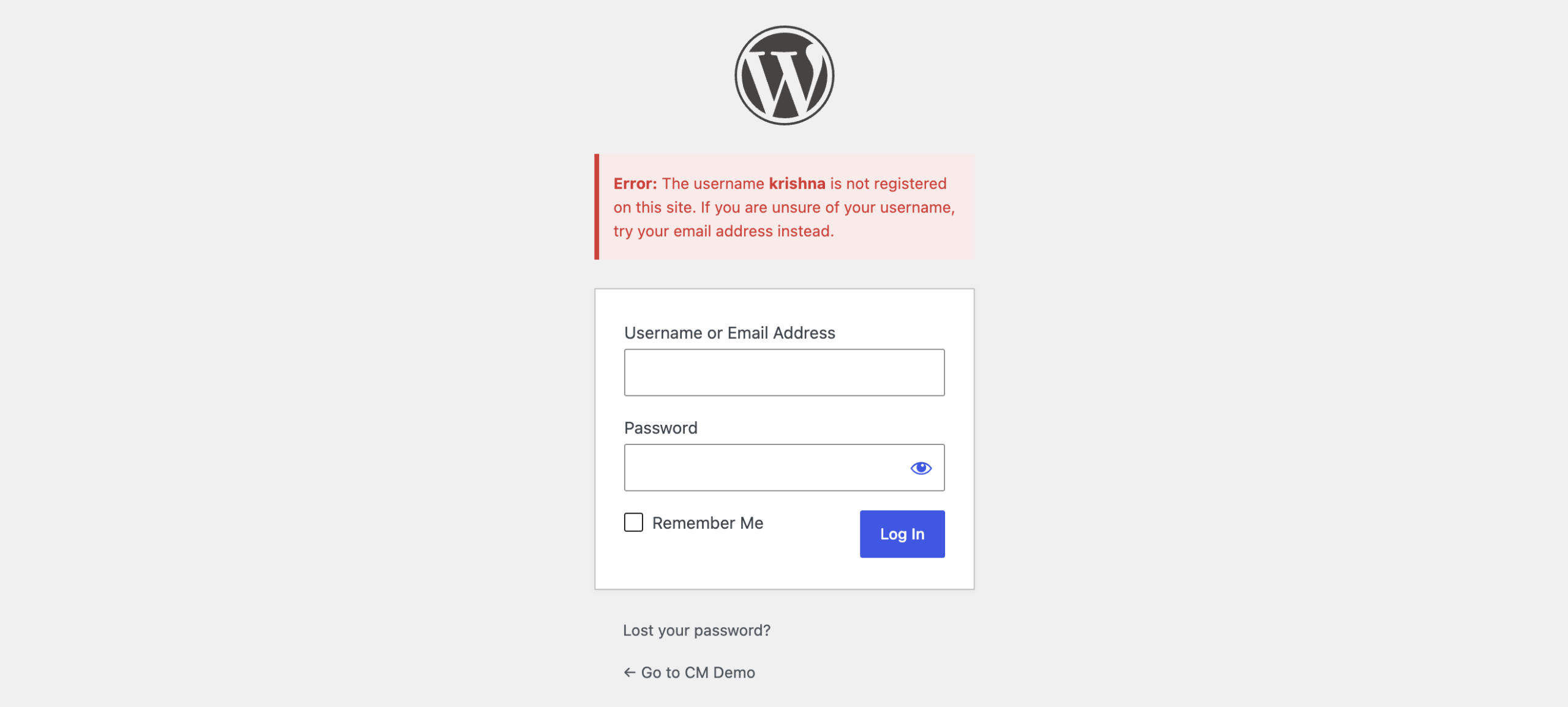
Click Save (⌘+S). Test the login page by entering a wrong password (to see an error notice) and resetting a password (to see a success or info notice).
Verify It Works
After saving, trigger each notice type on the login page and confirm:
- Entering a wrong password shows an error notice with your error colors.
- A successful password reset shows a success notice with your success colors.
- Other messages show the info colors.
If a notice does not use your colors, confirm Notices & Messages Styling is on and the changes were saved.
Examples
Example 1: Match Notices to Your Brand
A site wants its login notices to blend with the brand. Set the error, success, and info colors to muted versions of the brand palette while keeping each type distinct. The login page stays on-brand while obvious.
Example 2: High-Contrast Errors
A security-conscious site wants errors to stand out. Set the Error Notices background to a bright red and text to white. Errors are unmissable, which helps users notice a failed login.
Example 3: Soft, Rounded Success Notices
A friendly brand wants a softer success look. Set the success notice background to a pastel green and text to a dark green. Success messages feel calm and positive.

Add your first comment to this post