




What Is Login Form Styling
Login Form Styling is a white-label option in the Classic Monks White Label tab that changes the appearance of the login form on the login page. It is part of the Login Page Customization group. It controls the form’s background, text, input, and button colors, plus the border radius, padding, border, and shadow.
It is separate from the Custom Login Logo and Navigation Links Styling options. This guide covers the login form itself.
Recommendations Before Enabling
- Match the button color to your brand. The login button is the primary action, so use a brand color that stands out from the form background.
- Keep text readable. Ensure the text color contrasts with the form background color, especially for the submit button.
- Test on mobile. Check that the form padding and border radius look right on a phone screen.
Style the Login Form
Step 1: Open the Login Page Settings
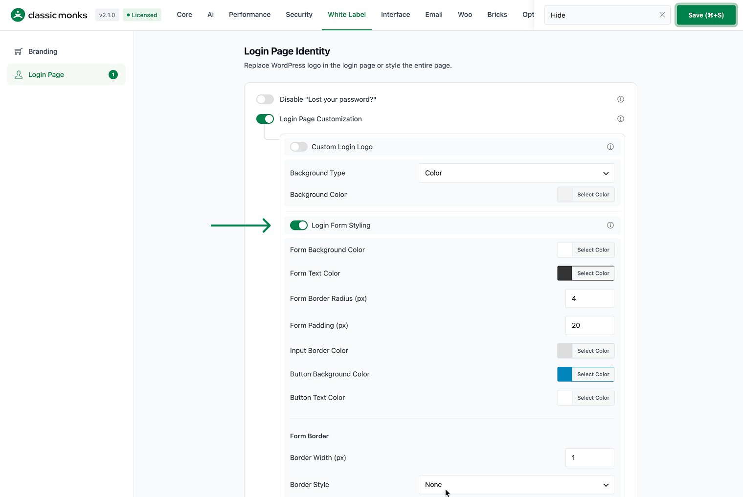
In your WordPress dashboard, go to Classic Monks, open the White Label tab, then the Login Page subtab. Toggle on Login Page Customization to reveal the form styling options.
Step 2: Turn On Login Form Styling
In the Login Form Styling section, toggle on Login Form Styling.
Step 3: Set the Form Colors
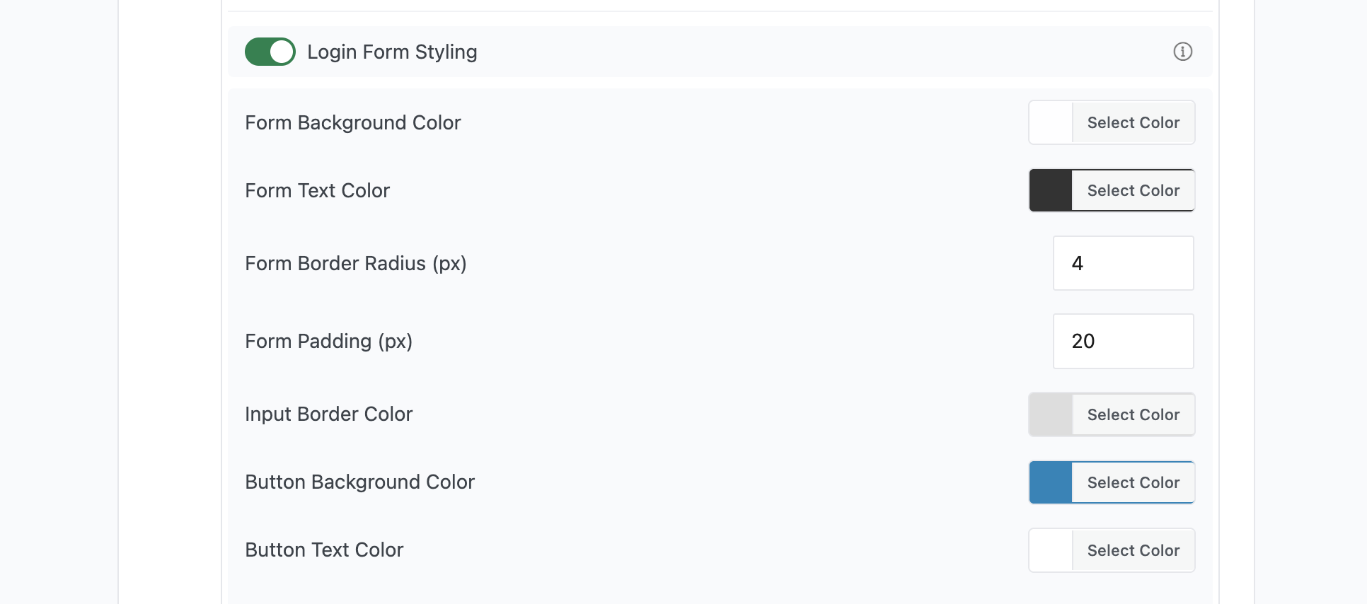
Use the color pickers to set:
- Form Background Color: the login form background, default
rgba(255, 255, 255, 0.8). - Form Text Color: the text inside the form, default
#333333. - Input Border Color: the border of the username and password fields, default
#dddddd. - Button Background Color: the login button background, default
#0085ba. - Button Text Color: the text on the login button, default
#ffffff.
Step 4: Set the Form Shape
- Form Border Radius (px): rounds the form corners, default 4.
- Form Padding (px): space inside the form around its content, default 20.
Step 5: Set the Form Border
Under Form Border, set the border width, style, and color:
- Border Width (px): the border thickness, default 1.
- Border Style: None, Solid, Dashed, or Dotted.
- Border Color: the border color, default
#dddddd.
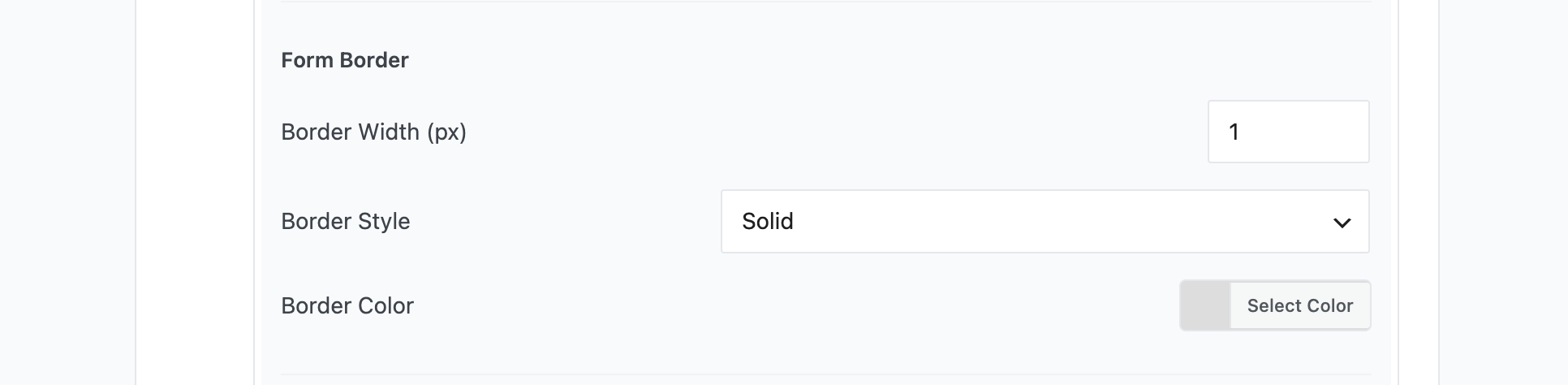
Select None for the border style to remove the border entirely.
Step 6: Add a Form Shadow
Toggle on Enable Form Shadow to add a shadow, then set the Shadow Color (default rgba(0,0,0,0.1)). The shadow lifts the form off the background for a subtle depth effect.

Step 7: Save and Test
Click Save (⌘+S). Open the login page in a private browser window to confirm the form styling appears.
Verify It Works
After saving, open the login page and confirm:
- The form uses the background, text, input, and button colors you set.
- The border radius and padding match your values.
- The border width, style, and color apply.
- The form shadow appears when enabled.
- The styling is consistent across the login page.
If the form changes do not apply, confirm Login Form Styling is on and you clicked Save (⌘+S).
Examples
Example 1: Brand the Login Form for a Client
An agency wants the login form to match the client’s brand. Set the Form Background Color to white, the Button Background Color to the client’s brand color, and the button text to white. Increase the border radius to 8px for a modern look. The login form now matches the brand.
Example 2: A Subtle Shadow for Depth
A site wants the login form to stand out from the background. Toggle on Enable Form Shadow and set the shadow color to a soft gray. The form lifts off the background with a subtle depth effect.
Example 3: A Borderless Minimal Form
A minimalist site wants a clean login form. Under Form Border, set the Border Style to None and set the padding to 24px. The form has no border and a generous inner space.

Add your first comment to this post